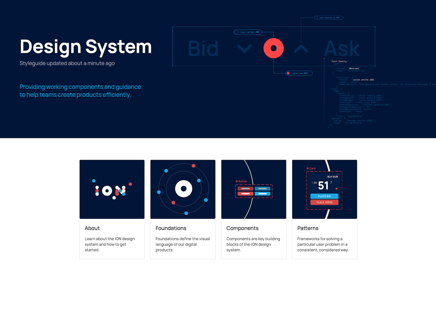
ION provide digital solutions for global financial institutions. With over 200 products in their portfolio they continue to grow. Maintaining and improving the visual design and user experience of such a diverse range of products presents a significant challenge.
The objective was to align all of these products with a new ION digital identity and establish a more efficient system for managing them in the future. To address this, we developed a scalable, tokenised design system that ensures a consistent approach to visual design and user experience across multiple products.


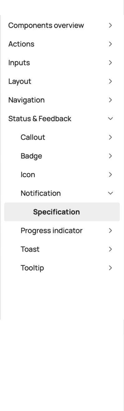
Tokens
Tokens are names given to design choices, used by design and development in place of hard-coded values, such as hex values for colour or pixels for spacing. A robust naming structure with three levels of tokens was created to allow control of sweeping changes to a whole interface, down to specific detail of a component.
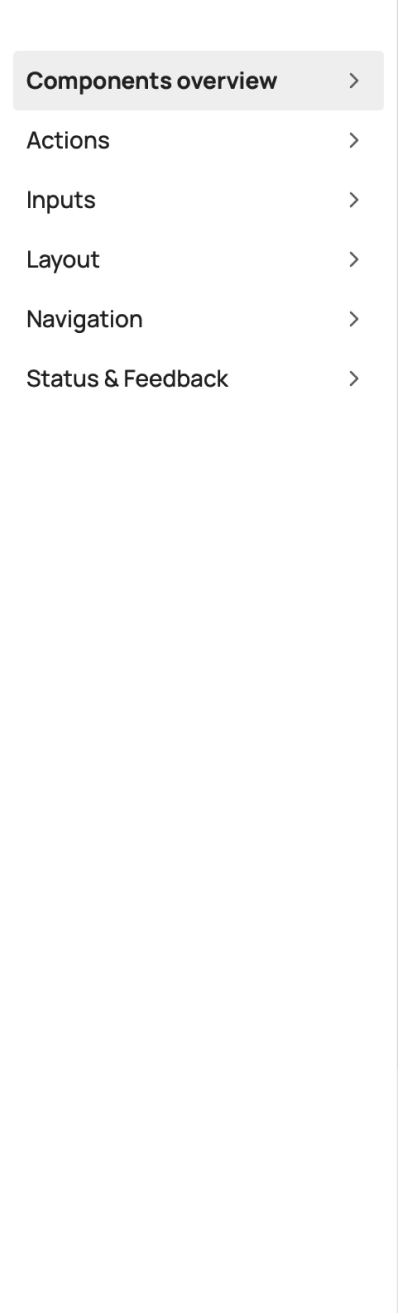
Select a style attribute from the list below to see how it get’s
transformed into a token and placed on a component.
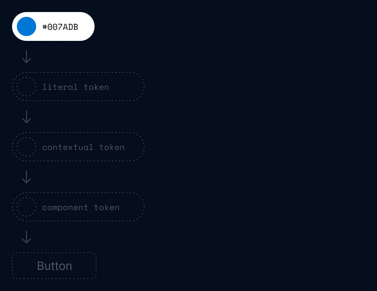
In this example we take a hex colour value through the three levels of tokens to give us the background colour of a button.
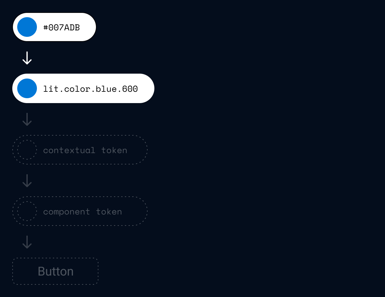
A literal token references the colour value and is represented by a self-explanatory name.
Because the other token types reference literal tokens, changes made to literal tokens result in global style changes to an interface.
Literal token
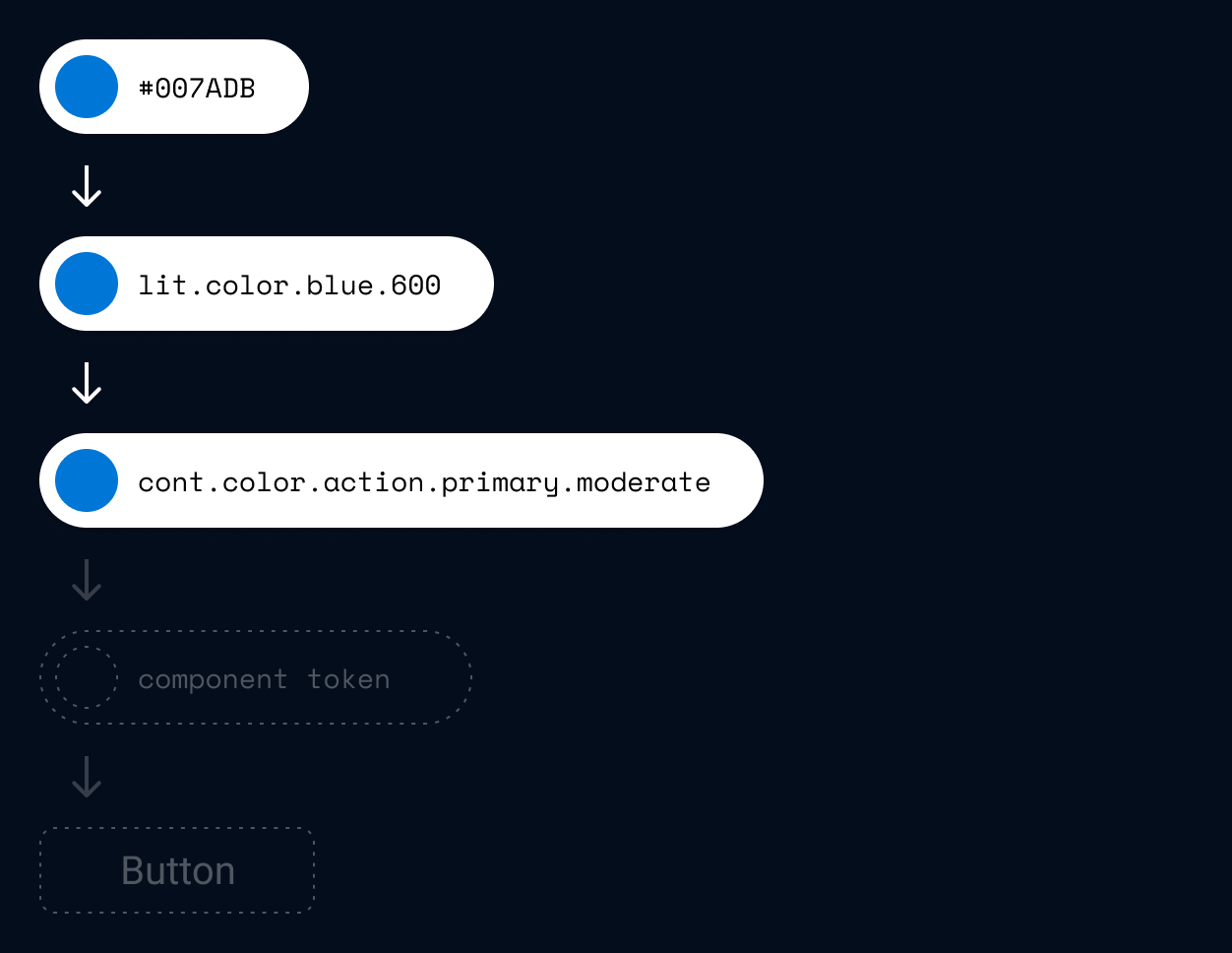
Contextual tokens reference literal tokens. They have specific context based on the functions or purpose of the UI element to which it is applied to.
Changes made to contextual tokens will effect multiple UI elements with the same purpose.
Contextual token
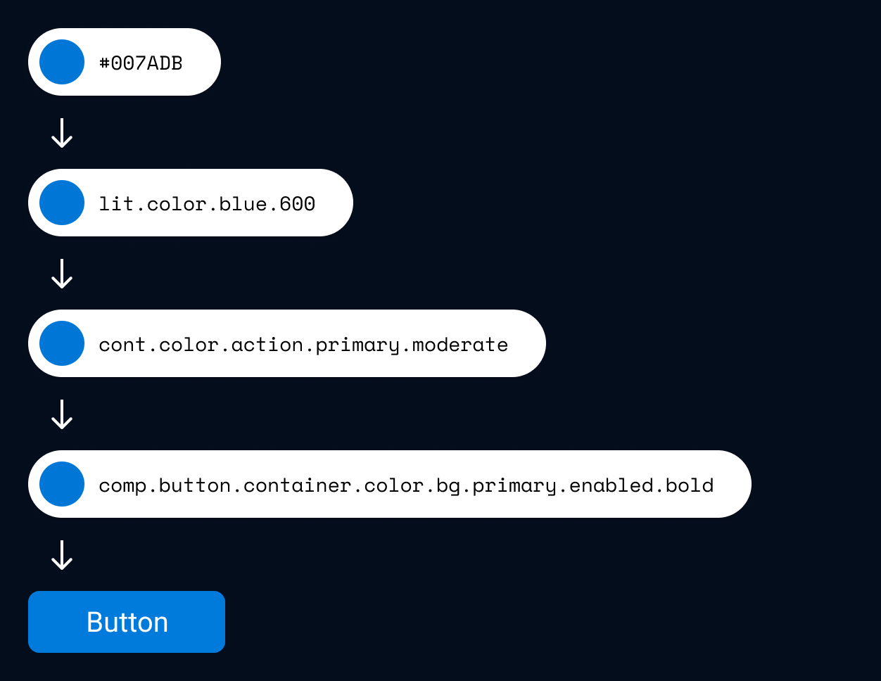
Component tokens reference contextual tokens. They define the style of every elements that forms a component.
Changing values in a component token will only change the components that reference this token.
Component token
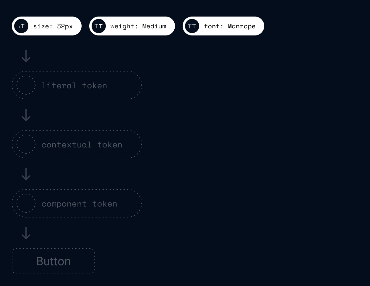
In this example we take a text style through the three levels of tokens to give us the button label typography.
Tokens can reference a number of values at once, here we combine the text styles of size, weight and font family into one token to give us a complete type style.
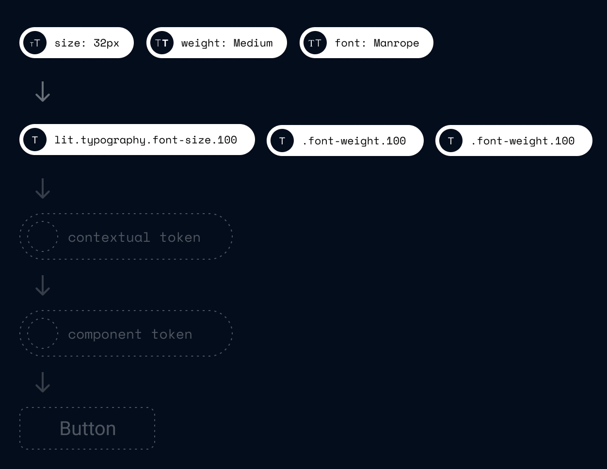
A literal token references the typography values and is represented by a self-explanatory name.
Because the other token types reference literal tokens, changes made to literal tokens result in global style changes to an interface.
Literal token
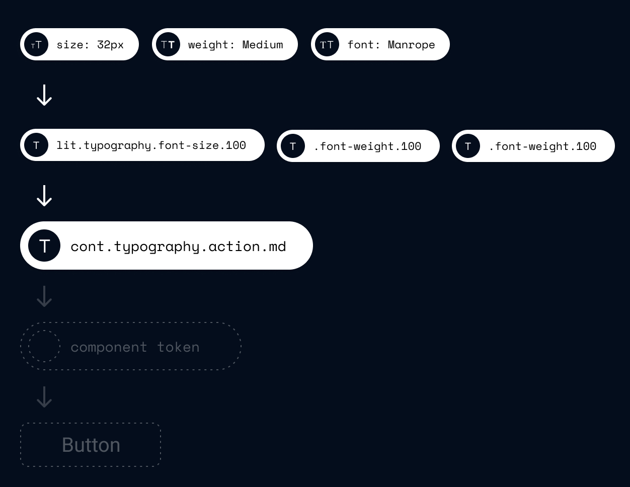
Contextual tokens reference literal tokens. They have specific context based on the functions or purpose of the UI element to which it is applied to.
Changes made to contextual tokens will effect multiple UI elements with the same purpose.
Contextual token
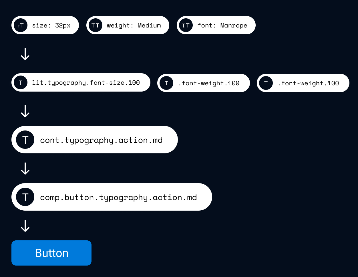
Component tokens reference contextual tokens. They define the style of every elements that forms a component.
Changing values in a component token will only change the components that reference this token.
Component token
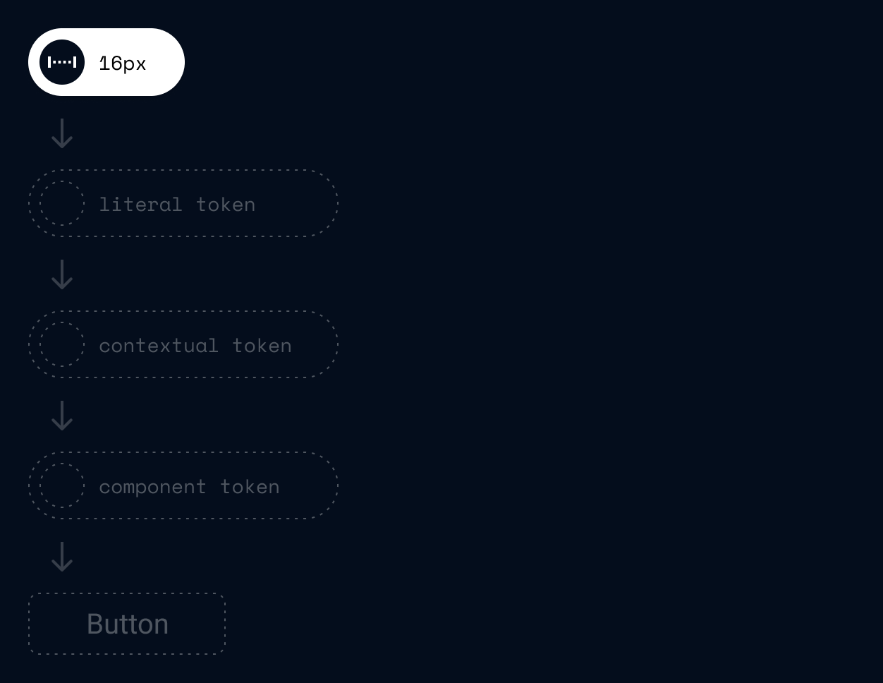
In this example we take a a pixel value through the three levels of tokens to give us the padding of a button.
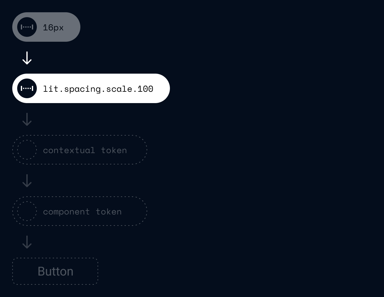
A Literal token reference a pixel value and is represented by a self-explanatory name.
Because the other token types reference literal tokens, changes made to literal tokens result in global style changes to an interface.
Literal token
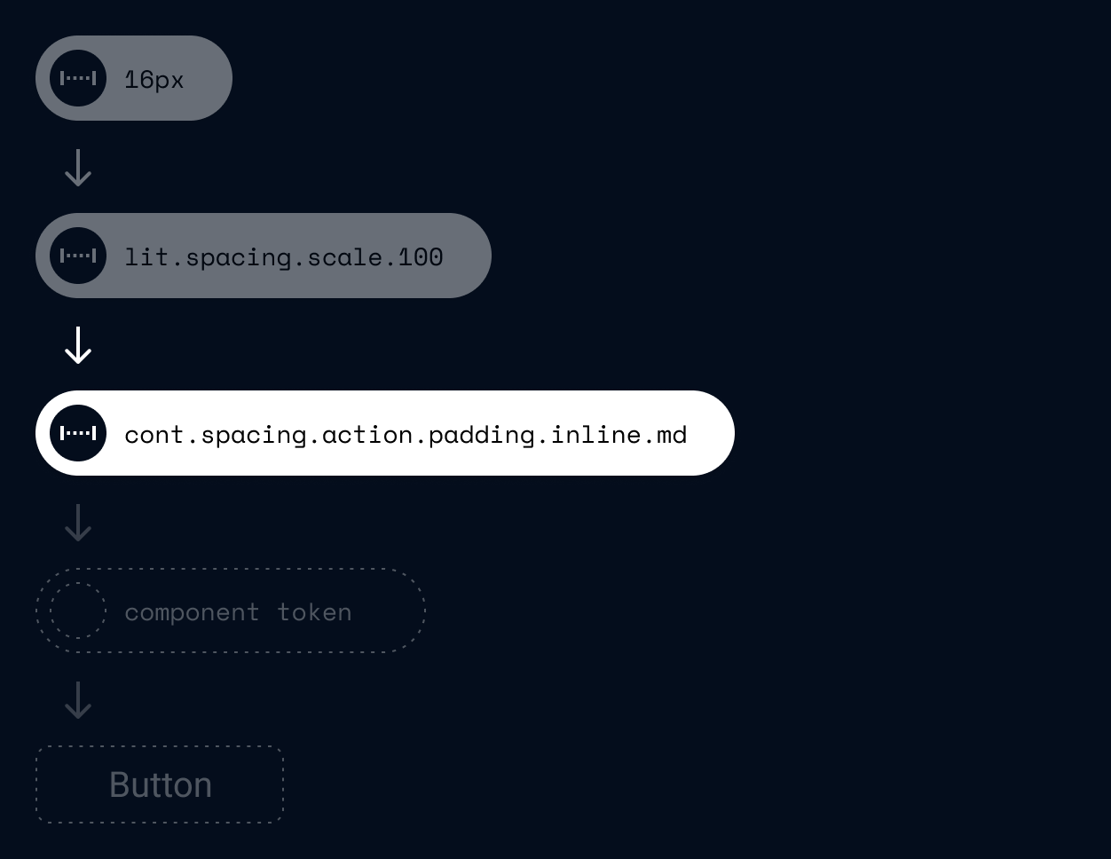
Contextual tokens reference literal tokens. They have specific context based on the functions or purpose of the UI element to which it is applied to.
Changes made to contextual tokens will effect multiple UI elements with the same purpose.
Contextual token
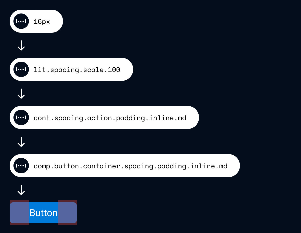
Component tokens reference contextual tokens. They define the style of every elements that forms a component.
Changing values in a component token will only change the components that reference this token.
Component token
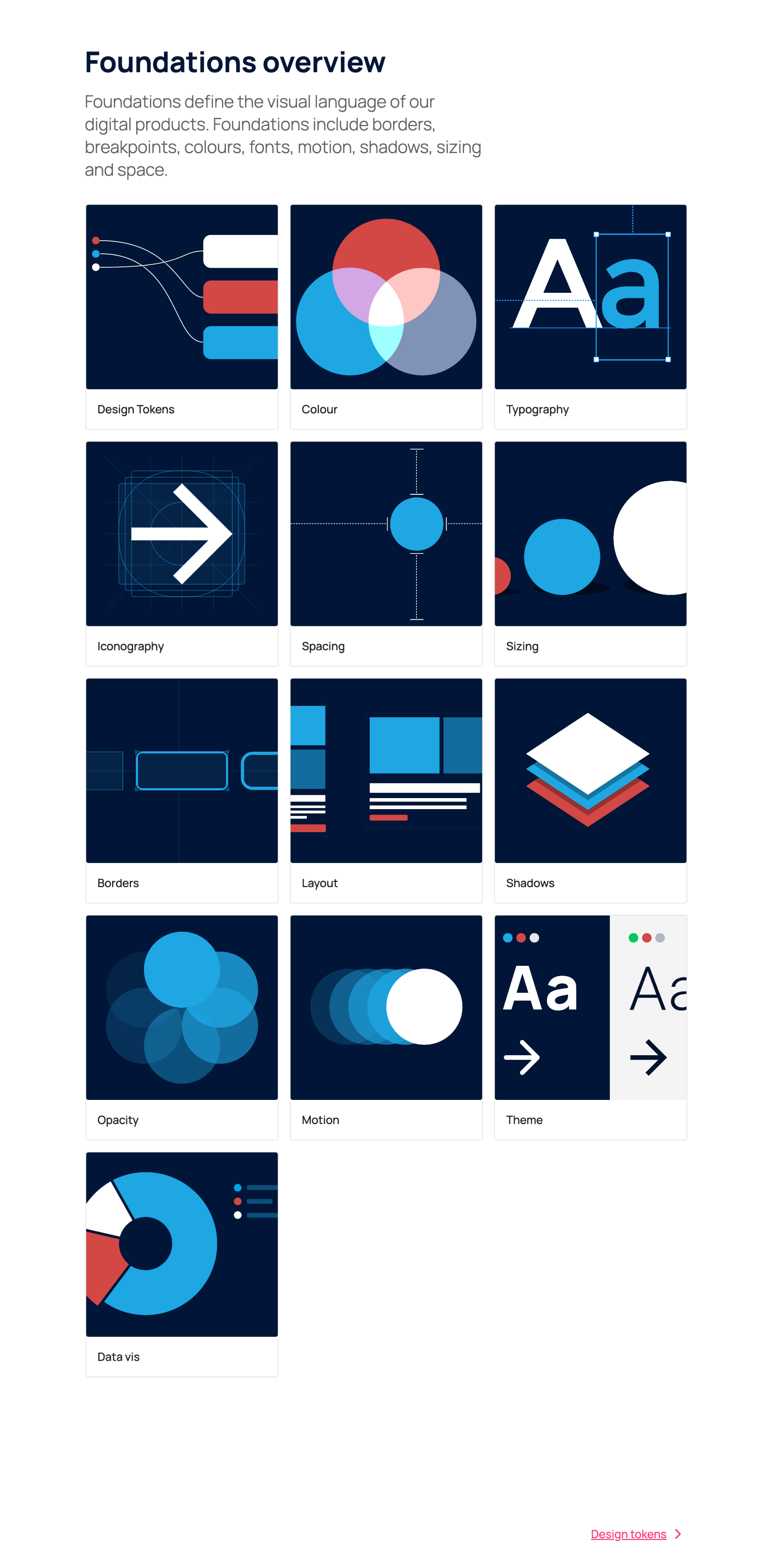
Specifications
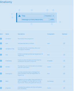
We documented the anatomy and structure of each component to defines how every element is placed and grouped, what specific properties are used to achieve the required layouts and styles, and their corresponding tokens.
The specifications are used to build the component in code and figma, ensure the naming, structure and tokens are the same in design and development.
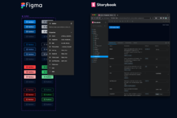
Components for designers and developers
Components are the building blocks for creating a user interface.Figma components for designers are built to the exact specification and have the same functional properties as coded component for production. Handing off design files to developers becomes a simple process with no room for error.
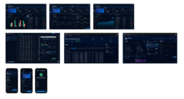
Adoption
Most IONs products are now integrated into the design system, visually refreshed, with an easy and rapid workflow for constant evolution.